THE HAMPTON CHRONICLE
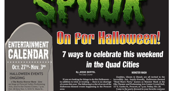
Weekly Community Newspaper
Design and Pagination
The Challenge:
Create the visual content to accompany news articles, special sections and splash pages highlighting various events in the area. Also responsible for the advertising design, classified pagination and overall design of the paper
The Execution:
Layout content using Adobe products, and responsible for pre-flighting and sending to press on or before deadline.
The Rewards:
As the sole designer, it always amazes me when the paper comes together in a day and with no errors!
 |
|---|
 |
 |
 |
 |
 |
 |
 |
"101..." MAGAZINE SERIES
101 THINGS
MAGAZINE SERIES
The Challenge:
Design a magazine series depicting various topics in short paragraph form, with each listing accompanied by a relevant image. The first series was "101 Things to do in The Prescott Area" and followed by "101 Things to do on Your Birthday, Things to Collect, Ways to Give Back to the Community, Things to do Before You Die" and finally; "101 Items You Can Buy Locally". The magazine needed to have a consistent, immediately identifiable design but still stand out individually.
The Execution:
Once I decided on the cover design, the rest all fell into place. I incorporated page tears, thumbtacks, pieces of tape, isolated art and other various imagery to give the magazine that "bulletin board" feel.
The Rewards:
Although I had left my position after the first publication debuted, the series continues to prove a success in sales and reader feedback.
ACROSS THE STREET
ARTS & ENTERTAINMENT TABLOID
Weekly Arts & Entertainment Section Rebranding
The Challenge:
I was just two days into my new position as Graphics Supervisor when the newly rebranded section the paper had worked so hard on was published and the Advertising Director HATED IT!! I was then tasked with creating a new look for the publication for the NEXT WEEK! (This is why I truly LOVE newspaper world). The Advertising Director had two pieces of input that was insisted on; I had to use a very specific font because of the fondness for the letter "A" and keep the cover less crowded.
The Execution:
The font screamed "NEON" so, I decided to create the logo like a neon sign. I decided to fall back on my Alternative Press cover designs and just use a single image with minimal text. The biggest challenge is working with little to no high-resolution imagery that is made available by the featured venue.
The Rewards:
The section has been received favorable by our readership and the true reward is the end result of bringing nothing to life.
HARTFORD COURANT
A-1 and News/Features
The Challenge:
Design a different page for each day’s Features and Main News pages and address last-minute changes.
The Execution:
Design pages using NewsGate CCI program, pull in shapes and text to enable Chicago editors to edit and alter as needed.
The Rewards:
Producing a visually-rewarding product error-free and before deadline.
 |
|---|
 |
 |
 |
 |
 |
THE CROSSROADS CHRONICLE
WEEKLY NEWSPAPER REDESIGN
A-1 and Editorial Pages
The Challenge:
The prior newspaper design was outdated and poorly designed. A local paper with a devout following (average readership 65-85 years of age) needed an updated look without driving away the constant subscriber.
The Execution:
Worked in tandem with the editor to design libraries, shapes, templates and advance the overall look of the publication.
The Rewards:
Re-design was welcomed by loyal readers and production was streamlined to meet and beat deadlines.
 Crossroads Chronicle A1Before Redesign |
|---|
 Crossroads ChronicleA1 Page After Redesign |
 OpEd Page 4OpEd Before Redesign |
 OpEd Page 4OpEd page After Redesign |
ALT. WEEKLY TABLOID NEWSPAPER COVERS
HARTFORD ADVOCATE/WEEKLY
For over 13 years I had the opportunity to design some fun, out-of-the-box covers for the Hartford area alternative readers. Here are just a few of my favorites.


The editors wanted a Scholastic Books-style cover.

Who knew a little Alt-Weekly could predict the future?

... deserves a clean cover.


The writer really wanted this type of cover.

We quickly staged this outside with the assistance of a fellow staffer. The was considered risqué for the paper at the time.

Nothing changes...
PAINTING PETS
The Challenge:
The images supplied for this story were really bad photos of really bad pet paintings.
The Execution:
The HBO series “The Sopranos” was the inspiration. The episode where Tony commissions a painting of himself and his horse and he’s portrayed as a General.
The Rewards:
A fun cover for a story with very limited images.
 |
|---|
MISSING CONNECTICUT ART
The Challenge:
Take a not-so-visually compelling story and try to create a cover that entices the reader to pick up the issue.
The Execution:
Some stock art, an image of one of the missing paintings and free reign with the art direction and a bit of Adobe Photoshop.
The Rewards:
A less than 35% copy return for that week.
 |
|---|
FALL ARTS PREVIEW
The Challenge:
The images provided had no real cover potential, but needed to showcase the event with an actual piece in the show.
The Execution:
The cover image “Stardust Motel”, 1977 by John Baeder, was tightly cropped and the motel sign altered with Adobe Photoshop for new cover text.
The Rewards:
A cover that visually represented the event and hi-lighted one of the artist’s more compelling pieces.


